The Educational Equality Institute: Donation Page Optimization
The Challenge: The Educational Equality Institute (TEEI) wanted to optimize its Donation Page, in anticipation of increased website traffic, after learning it would be mentioned in a documentary film that was debuting worldwide on MTV. We had less than a week to research, test and design .
The Solution: Less user frustration. The addition of homepage buttons shortened the path to donation, adjustments of visual design made the donation dialogue easier to see, and the information that survey respondents wanted was included. Statistical analysis revealed less user frustration after the redesign, with users spending less time on the page and making 93% less u-turns.
Client
The Educational Equality Institute
UX Team
Tatjana Iljaseviciute - PM & Developer
Jamie Ramsay - UXR
Ekaterina Frolenko - UXD
Reena Lashand - UXD
Priya Rao - UXD
Time Frame
1 week
Tools & Methods
Figma, Hot Jar, Secondary Research, Survey, Competitive Analysis, Usability Testing, Wireframing, Prototyping
Skills
Research, Ideation, UX/UI Design, UX Writing, Data Analysis
The Context
On short notice, The Educational Equality Institute (TEEI) learned that they would be featured on a worldwide documentary debut on MTV: Don’t Leave Me Behind: Stories of Young Ukrainian Survival. TEEI is a Norwegian Non-Government Organization (NGO) working to empower Ukrainians displaced by war through free language and upskilling or job training courses, both remotely and in their relocated countries. In anticipation of new eyes on the organization, TEEI wanted to spruce up the donation page to provide an inviting and easy interface for donation. Originally, it had been put together on the fly through a template.
TEEI had been gaining corporate sponsors and donations steadily, but thought a review of the current page design could help maximize potential donations. Our design team of four had under a week to conduct research, propose new designs and deliver a prototype that could be executed within WordPress via the Divi editor. Additionally, the format of the donation dialog box was a fixed format with only minimal design options available to change.
Research Goals
With an extremely compressed timeline for research, I decided a survey might be a good way to collect input quickly from a broad range of folks. Additionally, I reviewed other well-known NGOs and charities to reference how they solicit donations online. Finally, there is a wealth of analysis of best practices for donation pages discussed online, that I took into account.
We sought answers to these questions:
How are other charities soliciting donations online?
What drives a person to donate to a particular charity?
How frequently do people donate to causes they support?
What charities make donation easy?
What information do people want to know before donating to a charity?
By employing these methods:
Secondary Research
Competitive Analysis
Assumptions
TEEI’s mention in a worldwide documentary release will increase the number of visitors to the website and subsequent donations (later challenged by data, below)
There are issues with the current donation page design
We can make impactful, data-based design changes within a week
The Survey
“It’s really important that a majority or 100% of my donation goes straight to the cause and not the organization’s pockets. It’s also important that the NGO had a good reputation and solid leadership (integrity)”
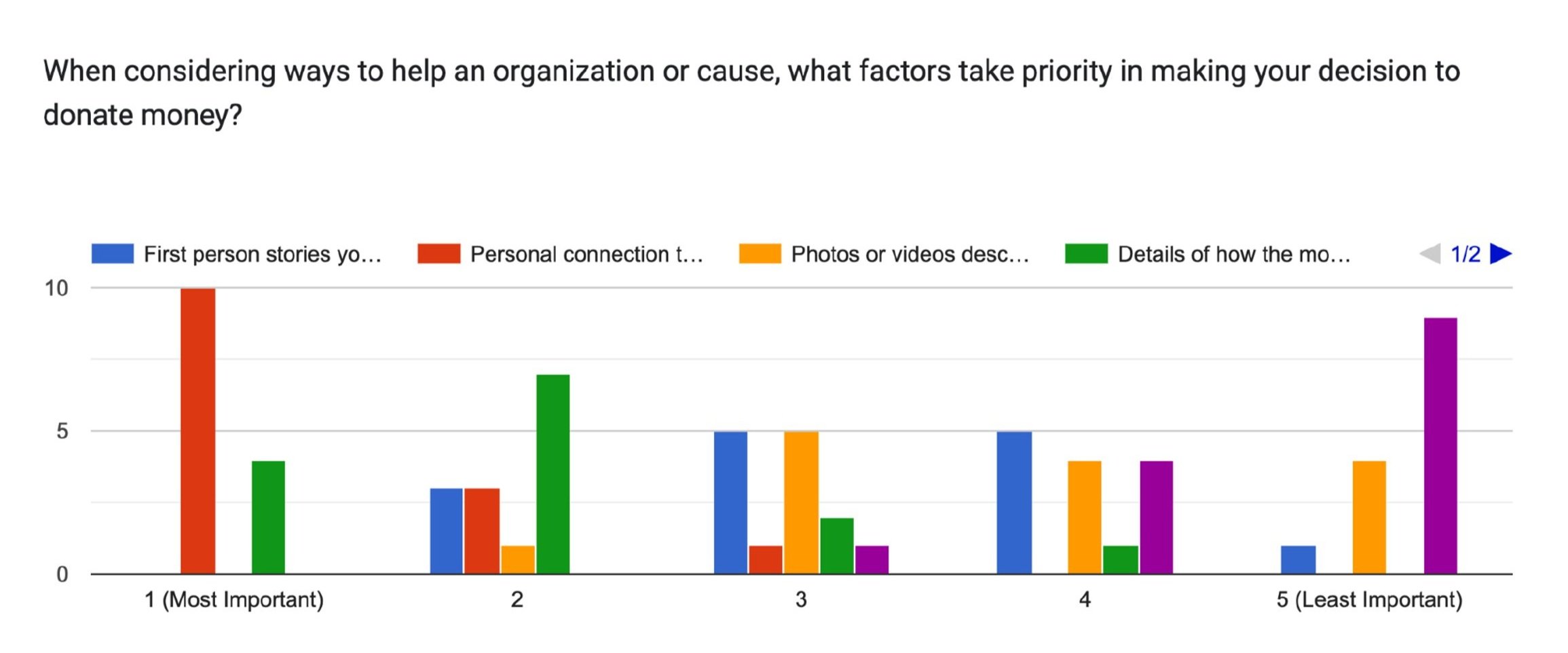
Survey respondents prioritized personal connection to the charity and knowing how donation money is used, in their motivations to donate money.
How were those priorities addressed on our donation page prior to redesign? Our old donation page offered few compelling stories with which to connect, except a photo of a child without context. The ways that money were used were listed, but low on the page, likely overlooked, and easily lumped in as superfluous text by someone quickly scanning the page.
42.9% of survey respondents donate monthly to causes they support.
How easy do we make it to donate monthly? Honestly, it’s a very easy button selection with in the donation dialog box. The appetite to regularly donate is there, so maybe we just need it to be easier to find our donation page on the site.
50% of our surveyed donors were 35-44 year- olds.
MTV’s demographic skews younger, with a majority of their audience in the 18-34 year old range. Only 15.88% are in the 35-44 year old range. This is where data challenged our assumptions. It is possible the viewers seeing this MTV documentary were not as likely to donate in the first place.
*Broader surveys in the U.S. and U.K. show average age of 64 or 65-74 respectively.
Design Inspiration
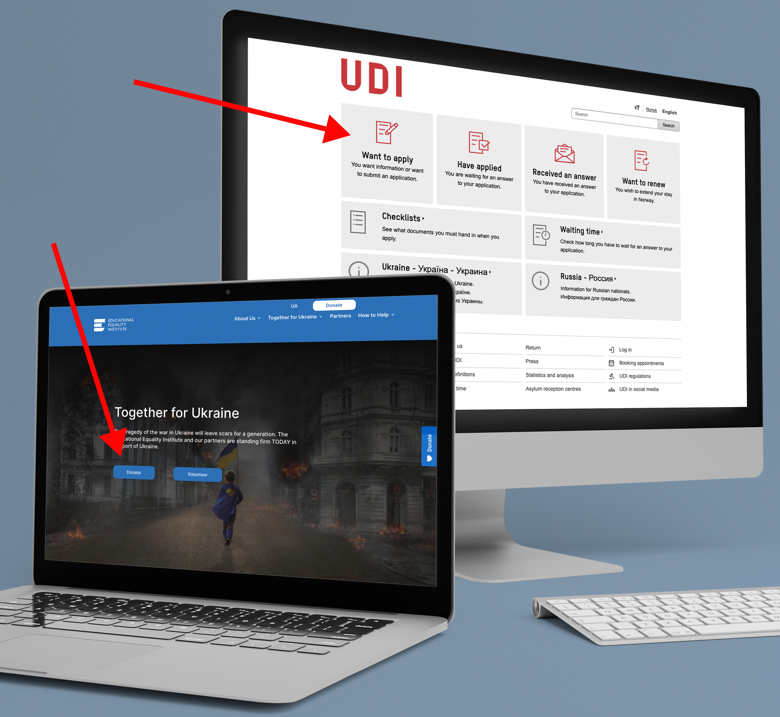
Inspiration: We used Norway's Immigration website (UDI) and The International Rescue Committee (IRC) for design inspiration.
UDI’s well-loved homepage is a usability dream with simple text buttons that lead you pages based on the action you wish to carry out.
Implementation: That inspired our addition of a button on the homepage to bring you to the Donation Page. Previously, the home page featured a scrolling donation button on the far right that was not always obvious.
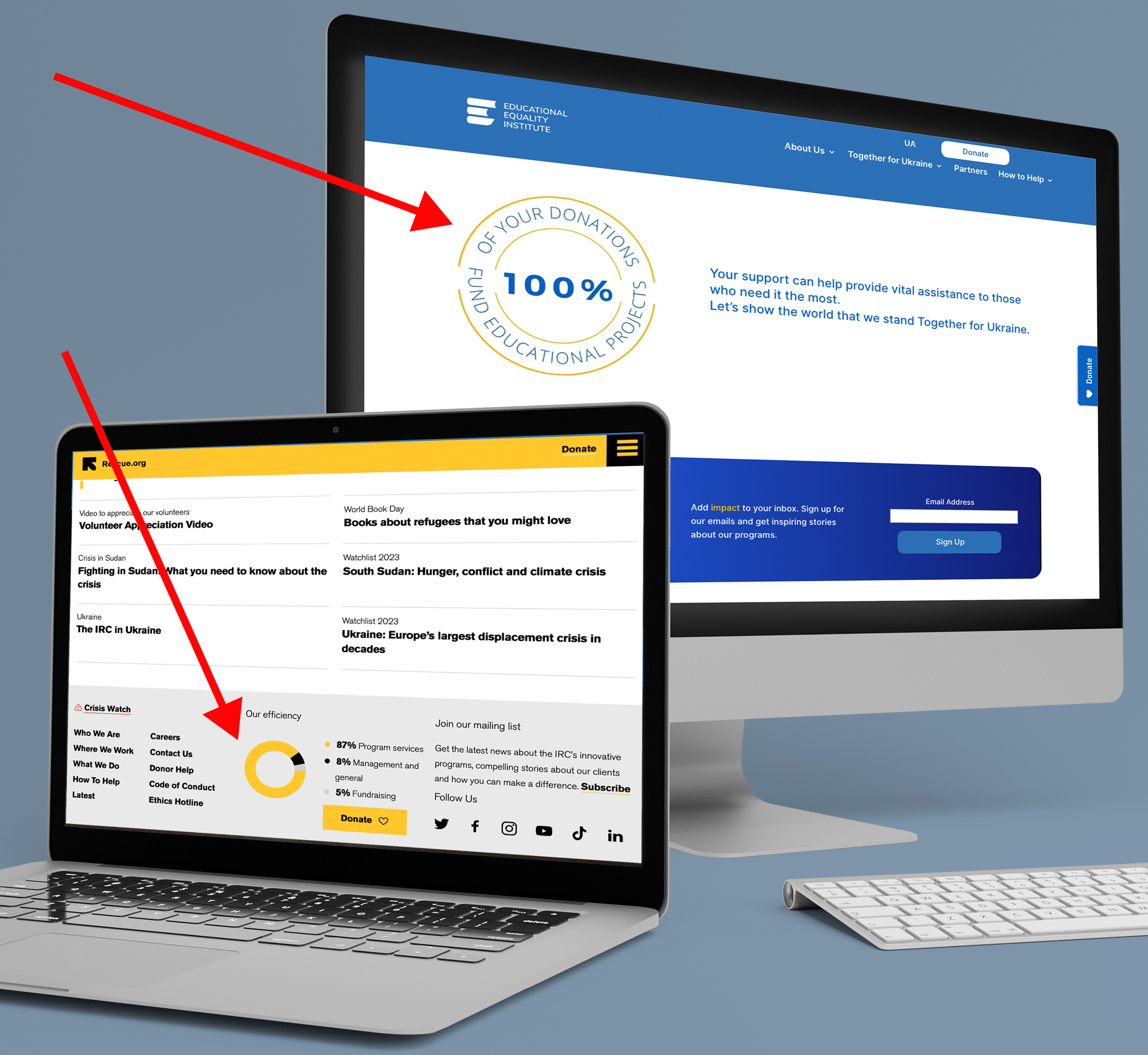
Inspiration: Highly respected IRC conveys the use of donation money in their footer with a quick read pie chart detailing “Efficiency” of donation money.
Implementation: Since 100% of donations that go to TEEI go directly to services, we knew this was something important to users and we decided to also employ the quick read pie chart with a graphic near the donation dialog box.
We also added personal video testimonials from people benefitting from TEEI’s services to address user comments regarding a desire for personal connection to causes to which they donate
How Did We Do? (so far)
The changes we made were constrained by time and the Divi editor, but we were happy to observe progress from the changes we made and continue to evaluate the data.
Small wins : u turns were down 93% coupled with a 10% decrease in time spent on page. Minimally, it is less frustrating to be on the page, and we hope the decreased time spent on the page was due to efficiency, as suggested by heat maps comparing the original layout to the current redesign.
There is still some work to be done in getting people to donate, but hopefully we are providing users more of the info they request and incentivizing confident donation and trust in TEEI.
Reflections
While the interface seemed easier to navigate as supported by the statistics, we did not see an enormous influx of donations. There are several factors that could influence this beyond the design including donation fatigue and less of an effect from publicity than expected (perhaps due to the aforementioned demographic donation habits).
However, if those external factors do not come into play, it could also mean, we have more work to do in research and design. Follow up testing and evaluation like exit surveys on the page could help diagnose the slow in donations. I was happy to see that we moved the needle in ease of use. I see more persuasive language and aggressive marketing of the program as potential solutions.
This upgrade of the donation page was valuable in the long term. But we may have avoided rushing, had we taken time to research the MTV demographic and acknowledged that it did not match the most common donor age range.

We only have what we give.
— Isabel Allende


